Bikemap Pause Mode
The bike computer had no pause button, and 1.7 million recordings a year never became a route anyone kept.
Challenge
In 2022 riders started 2.6 million recordings in the Bikemap app. 2.2 million of those were ended, and 875,000 became a route saved to a profile. 1.7 million recordings never became a route anyone kept.
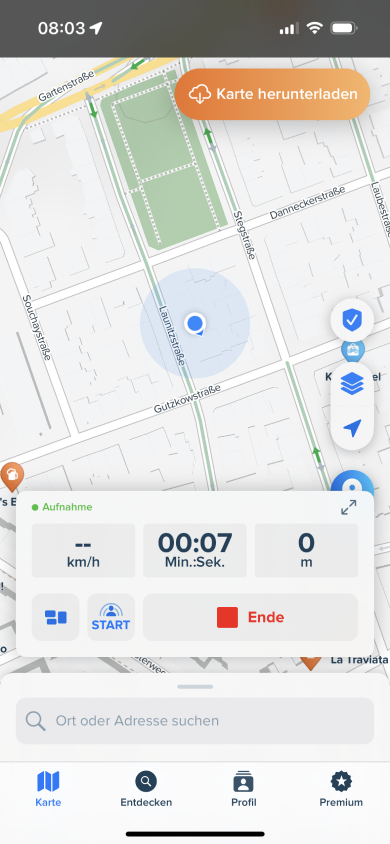
The bike computer had no pause button. Riders stop for coffee, wait at level crossings and catch their breath at the top of climbs. Without a pause, a break landed in the recording as a spiky clump that dragged the average speed down. Riders worked around it by splitting one ride into several recordings and uploading the fragments, or by not uploading at all. Pause was the most requested feature in Canny, the tool we used to collect user requests.
The team and my role
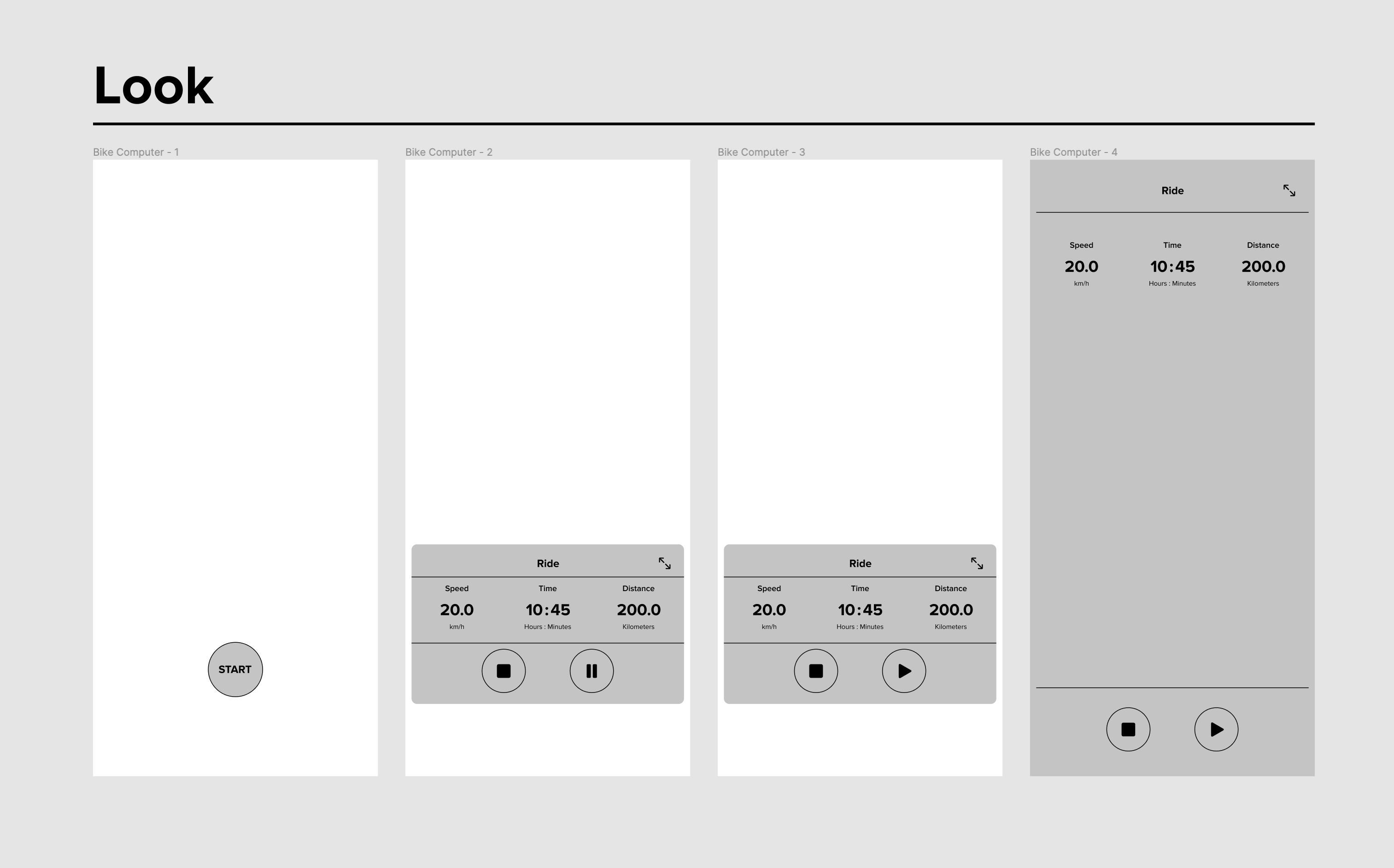
I ran this in both of the roles I held at Bikemap. I initiated the project, made the first wireframes and user flows, and wrote the spec; a colleague on the design team took the flows to high fidelity. iOS and Android developers built it on their own separate release schedules, backend developers solved saving and merging multiple route legs, and marketing planned the announcement in parallel so the feature would land with an audience. I pitched it in December 2022, and we built and shipped in February 2023.
Reading the request before designing the feature
The Canny threads told us people wanted a pause button, without saying what for. Guerrilla interviews and stakeholder conversations turned up three reasons pointing at different designs: riders who break for food and rest and want it excluded from their stats, riders who explore on foot mid-ride and do not want the detour in their track, and riders worried about battery drain on long tours.
The first two are a data-quality problem. The third is power management, which would have taken us somewhere else entirely, so we built for the first two and said which reason we had left out.
Deciding what “pause” means
The scope options were open: pause for recording, pause for navigation, or both. Manual pause, or automatic pause that detects when you have stopped moving. Auto-pause is the version riders recognise from Apple Fitness, Strava and Garmin, and it was the version several people on the team assumed we were building.
We could not build it. The backend could not save multi-legged routes, and the mobile clients had no feasible route to reliable stop detection. Building those foundations first would have pushed the feature past the riding season, on something users were asking for every week.
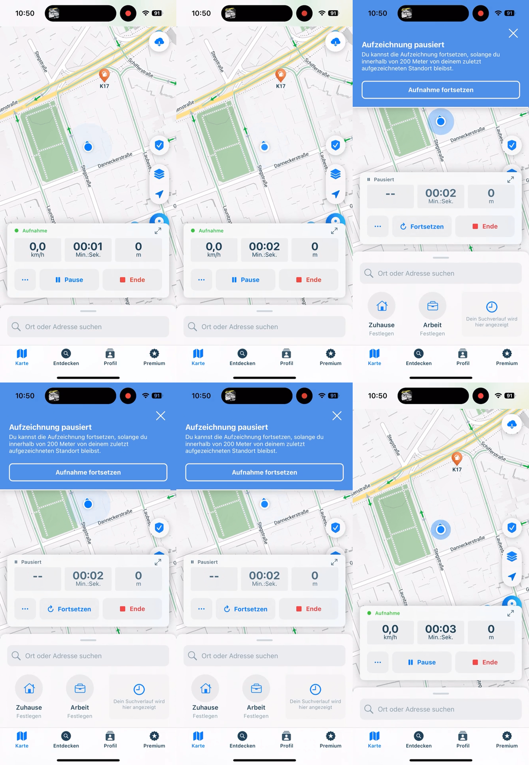
Key learning: we shipped with the gap named, and nobody argued about it. We released manual pause only, with auto-pause named in the release notes as a known gap and put on the roadmap. I had expected to spend the launch defending what was missing. Riders used the button that was there. The instinct to hold a feature until it matches what competitors already do is expensive, and here it would have cost us a season.
Prototype, test, cut
We tested high-fidelity Figma prototypes with users, used Overflow to hand the flows to engineers without ambiguity, and ran the build through Jira with the documentation in Confluence. Testing and QA changed four things: the copy got shorter, the pause notification stayed on screen longer because people were missing it, live metrics needed a defined behaviour while paused rather than continuing to tick, and auto-pause moved to the roadmap.
Key learning: getting engineers behind a pause button took C-level backing. A pause button is small, fiddly, platform-specific work with a lot of edge cases and no interesting architecture in it. Engineers do not queue up for it. Building real energy behind it took backing from the top and a repeated explanation of why the data-quality problem mattered to the business rather than only to riders. Communication was more of the job on this project than design was.
What worked and what did not
Splitting the “why do you want pause” question into three motives before designing anything was the decision the whole project rested on. So was shipping manual pause with the gap named rather than waiting for the backend work, and running marketing in parallel so the release reached people who had already stopped using the app.
Against that: we defined the success metric and did not get to measure it. The notification timeout was too short in the first prototype and only user testing caught it. And battery-conscious riders got nothing from this release, though they were a real third of the request.
Outcome
Pause Mode shipped in February 2023. Adoption landed around 20%, matching what we had expected when we scoped it. Support requests about the missing pause feature dropped off, and we saw riders reinstalling the app after reading about the feature in the newsletter.
Adoption was not the metric I wanted. In the Q1 success-metrics plan I defined it as the ratio of started to ended recordings, and of ended recordings to uploads, on the hypothesis that a ride you can pause is a ride you are more willing to keep. That measurement needed a quarter of data after release, and I left Bikemap before it arrived. The 2.6M / 2.2M / 875k figures are the 2022 baseline; the 20% is adoption. Neither proves the hypothesis was right.
The scope decision is the one I stand behind. We knew which limitation we were shipping, and we said so on the day.