teal-ui Design System
A two-tier token architecture at digital office, and the bridge to engineering I never built.
Challenge
When I arrived at digital office 24, one designer was working on features in a single Figma file. Many pages, few components, little reusability. Engineers reached for Material UI components with Angular, and in many cases did not adhere to the design, because Material UI was not flexible enough to match it.
I advocated for a Figma Team plan to get the room to build a design system. The problems it had to solve were concrete: a high-maintenance set of one-shot components, and frontend rebuilding the same thing again and again, which brought inconsistency into design and interaction and made bug fixing painful.
As more frontend engineers joined, I could get the team to move to Tailwind, build our own library piece by piece rather than from scratch, and use Storybook for faster design QA.
The team and my role
I started the system with a designer who joined at the same time. Neither of us had to convince the other. I took on more product responsibility while she kept improving the system; I stayed on it alongside the product-manager role, tokenising and replacing one-shot components whenever one turned up in a prioritised ticket. I set governance for two other designers who came through the company later. Being both design lead and PM gave the rules teeth, and left the system with a single point of failure.
Building from what was already on screen
The first library came from the components in use, not from a clean set nobody would have had time to ship. That made the first version less tidy but true to the product: inputs with inconsistent formatting, tables with fixed columns, modals instead of integrated detail views, too many button variants. From there I could argue about what should change while the product kept improving.

Figma alone was never going to hold the line. We needed a coded representation, so Storybook became the source of truth for design and frontend together: design could review components and interactions, and engineering could check proper usage, meaning whether somebody had built something that looked like the design without using the component behind it.
The team migrated onto the library because they had already built the components. I have designed several design systems, two of them multi-brand and top-down. A library derived from first principles can be correct and still be unrecognisable to the people holding the current implementation. Many teams never migrate onto one, because migration is a rewrite, and rewriting for the sake of a design system is risky and expensive. Building from what was on screen made the first version arguable rather than aspirational.
The token architecture
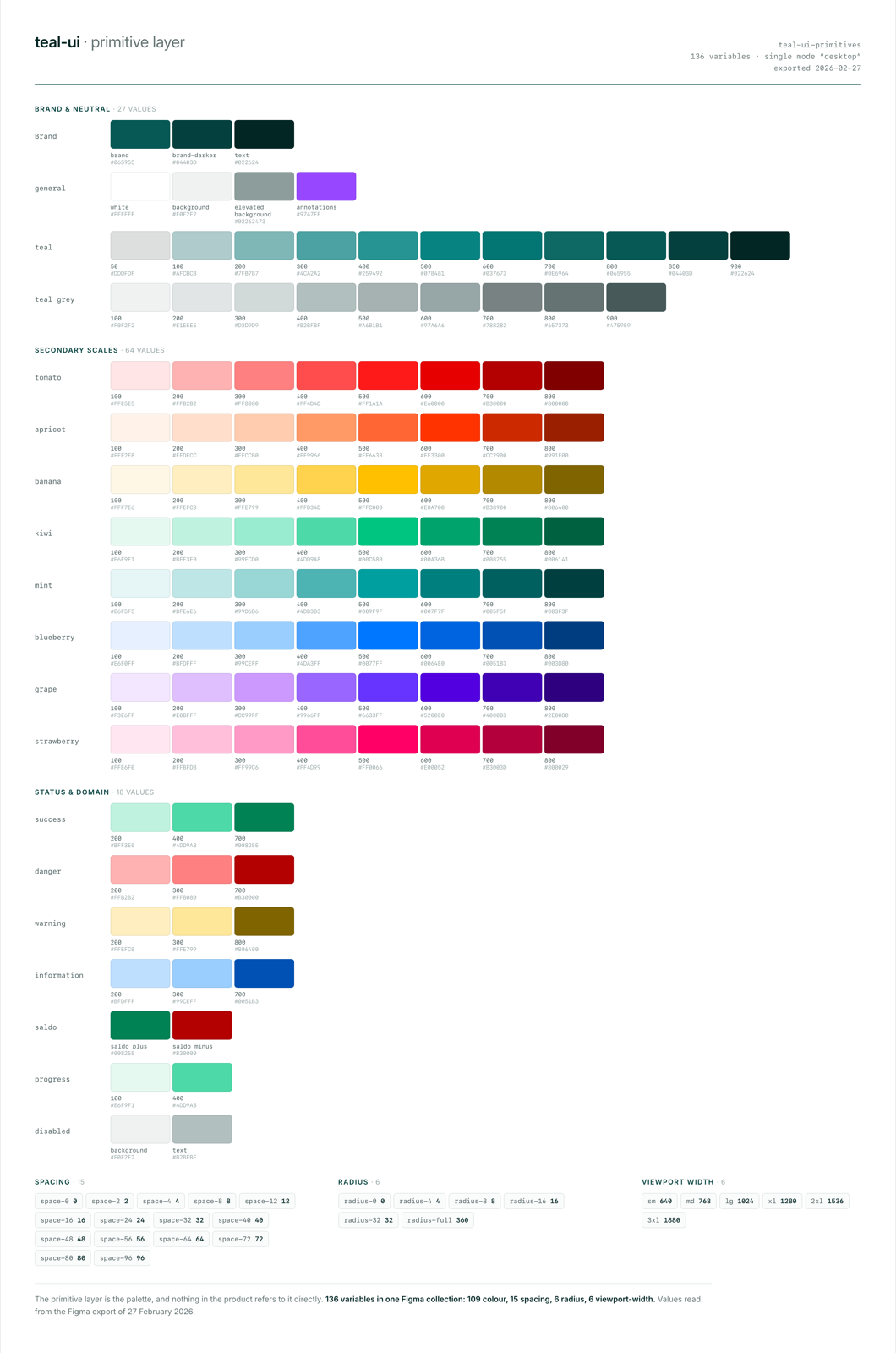
The colour system has two tiers. Primitives are the raw scales, teal, teal grey and eight
fruit-named secondary scales, and they are never used directly. Semantic tokens reference them and
carry purpose rather than appearance: action/primary, surface/card, feedback/danger-strong,
domain/saldo-negative. The split is what makes dark mode, or white-labelling for a client who
wants blue instead of teal, a remapping of the semantic layer with components left untouched. Use a
raw red for a danger button and somebody has to find and edit every usage again for every new theme.
Every background token has a paired on- token for whatever sits on it: surface/page and
on-surface/page, action/primary and on-action/primary. I took the convention from Bikemap,
where we had derived it from Material Design. Shadcn’s -foreground suffix does the same job with
more characters.
Key learning: the naming convention outlasted the documentation.
on-action/primarytells a developer the text colour on a primary button without a lookup, a wiki page, or a question to me. The documentation I wrote for this system may well be good, and it was never read twice. The naming convention is read every time somebody uses a token.
Giving the machine access
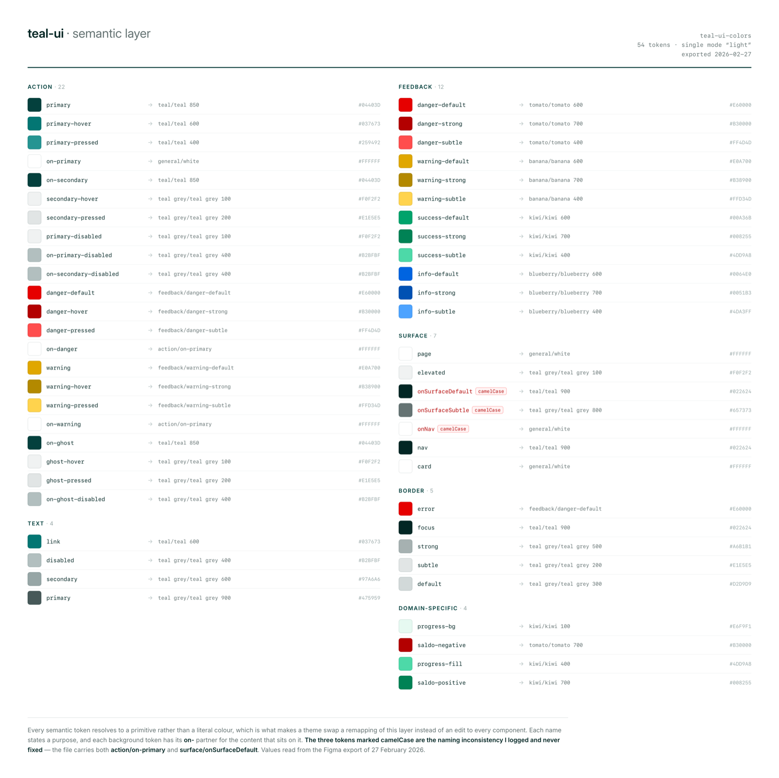
Tokenising also made the system readable to a language model. I could get Claude Code to produce
prototypes that used our components, and quick design generation started to look like our product,
which let stakeholders see what we were aiming at instead of imagining it. That work became a
design-context skill plus machine-readable token JSON covering primitives, semantic tokens and the
light/dark mapping, in a form an agent can apply without me translating a Figma screenshot into a
prompt.
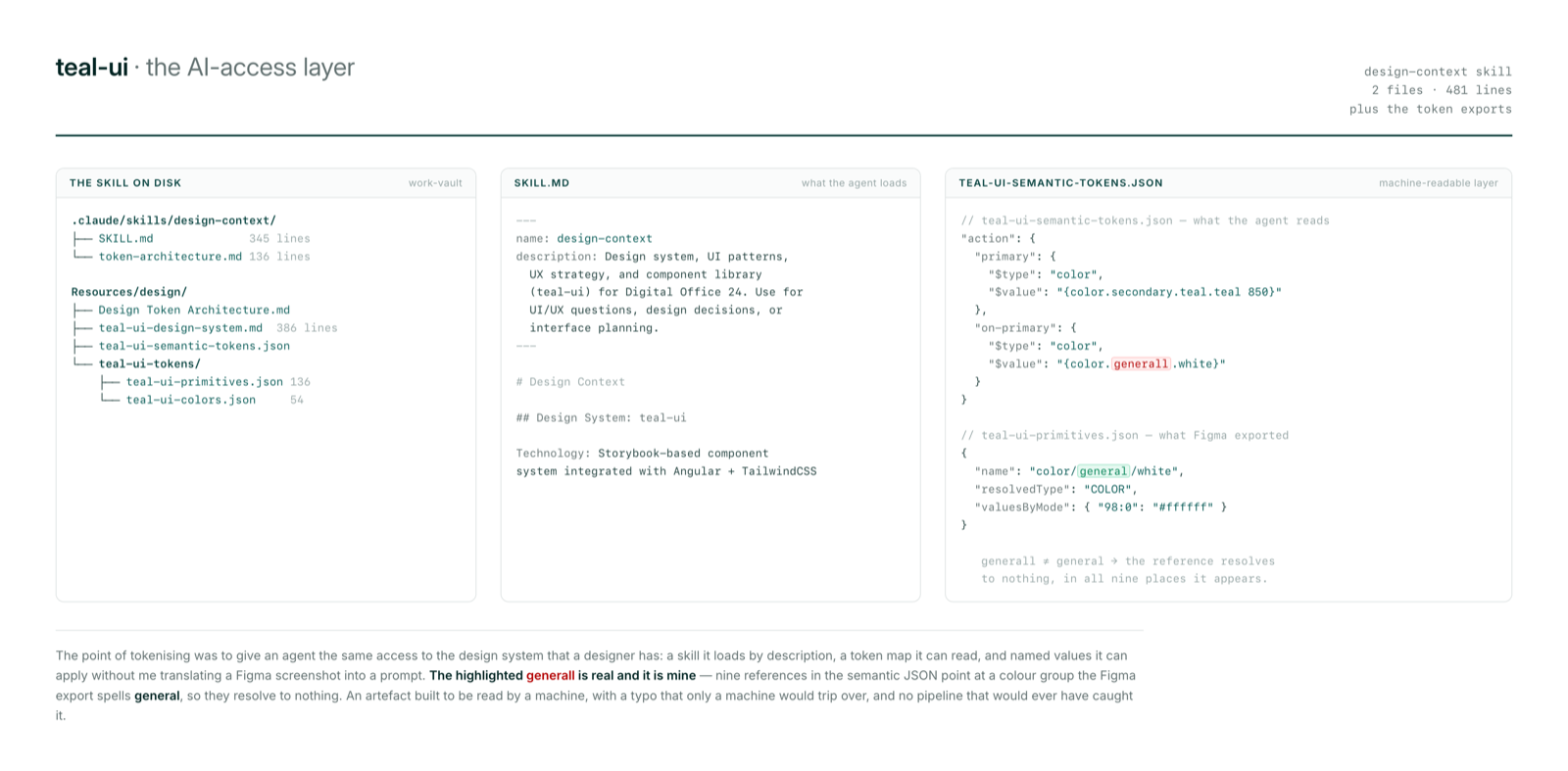
generall is a typo of mine that makes nine references resolve to nothing.
Governance, and what we left out
Governance was four rules rather than a document. teal-ui components are mandatory for new UI, new variants get documented in Storybook, new components are requested rather than invented, and one-shot custom components need approval. A consistency checklist covered the states designers skip, hover, active, disabled, loading, error and empty, plus keyboard navigation and WCAG AA contrast.
The third tier of the token model, component-level tokens, was specified and deliberately not built. We had not run into enough components with real edge cases to justify it.
Outcome
The product came out more consistent across everything we touched, with a coherent spacing system and components the frontend can configure rather than rebuild. Frontend implementation got faster: a bug fix took hours instead of days, and new features could be prototyped in the frontend quicker than design could build them in Figma. That is my recollection rather than a measured number, since nobody was tracking it.
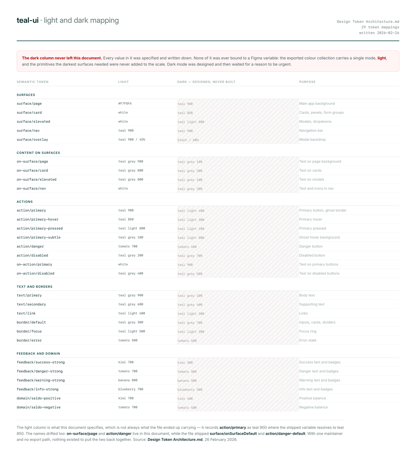
Key learning: tokens do not fix bad foundations, and they mean nothing until they reach engineering’s real stack. Mine stopped at Figma variables. There was no code export and no automated pipeline. I was solo-maintaining the system at times while also doing product and design, and stretched that thin I missed the obvious bridge: mapping the primitives straight onto Tailwind’s colour configuration and naming, which is the framework the frontend team already used every day. A design system in Figma has to speak the code’s language or it stays documentation. Next time I will not touch tokenisation before engineering and I agree how the tokens land in their daily work.
Dark mode was fully designed and never shipped. The library and the Storybook work are still in the product. The token architecture is good work that was never load-bearing, and when I left, the initiative lost the person driving it.
I would do plenty differently. I would not decide against having a source of truth between design and frontend. Whatever form it takes, it has to be something engineering already recognises and design can maintain.