Bikemap Route Planner
→ Live at web.bikemap.net/plan

Challenge
Bikemap shipped two web route planners that did overlapping jobs. The AB Planner took two addresses and generated a route between them. The Route Editor let you draw a route by hand on the map. Each had features the other lacked, users of one regularly missed what the other could do, and neither could be improved much, because both leaned on an external provider that set the pace of our innovation and charged us for it.
The AB Planner also looked its age, and that turned out to matter more than we expected: users read the dated interface as a signal that the map data behind it was stale. An outdated visual style was costing us trust in our own map data.
The team and my role
The initiative started in Q3 2021 and ran through both roles I held at Bikemap. I designed it and, once it outgrew a design project, managed it. Dominic on the design team worked with me on the components and got me unstuck when I had designed myself into a corner. Sebi, our lead web developer, built most of it and took over the parts I could not hold while firefighting as PM. Backend capacity was the binding constraint throughout, which shaped the sequencing more than any design decision did.
Two tools, two kinds of cyclist
Four findings shaped what we built. Each tool’s users missed the other tool’s features and had no reason to expect two separate products. People compared our geocoder unfavourably to Google Maps. The map styles riders knew from our mobile apps were missing from the AB Planner, so the web felt like a different company. And we could not fix any of it quickly, because an external provider owned the pieces that needed changing.
Could one tool serve both groups without getting worse for each? The two audiences turned out to be different. AB Planner users plan long tours, sometimes across whole countries, splitting them into segments for a multi-day trip. Route Editor users draw by hand through forests and trails where no official road exists, then load the GPX onto a bike computer. One wants overview at scale, the other precision at single-trail level. We built the first iteration for the long-tour planners, who needed screen space the mobile apps could not give them.
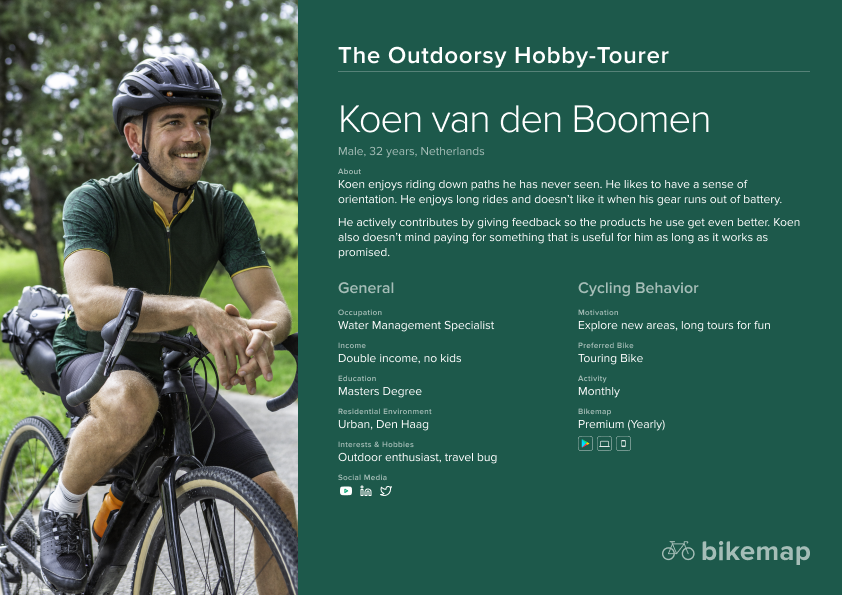
Even though the persona below was not created for this project in particular, it shows that we actively thought about our target audiences for each feature and platform.
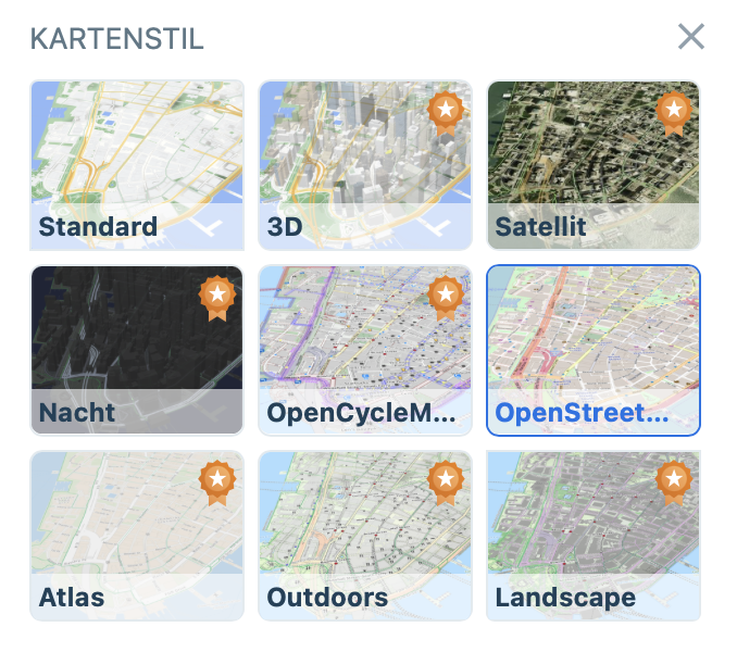
The AB Planner’s map styles came from the provider, so we could neither customise them nor keep them current, which is where the “the data must be old” perception came from. The Route Editor already used ours.
Designing the unified planner
The new planner pulled the address inputs from the AB Planner and the direct manipulation from the Route Editor into one left sidebar: waypoints with reverse-route and back-to-origin controls, routing profiles so a road cyclist could avoid gravel and a parent could avoid traffic, and stats for distance, ETA, speed and elevation. We also brought the map styles home, using the ones we host ourselves and riders already knew from the mobile apps.

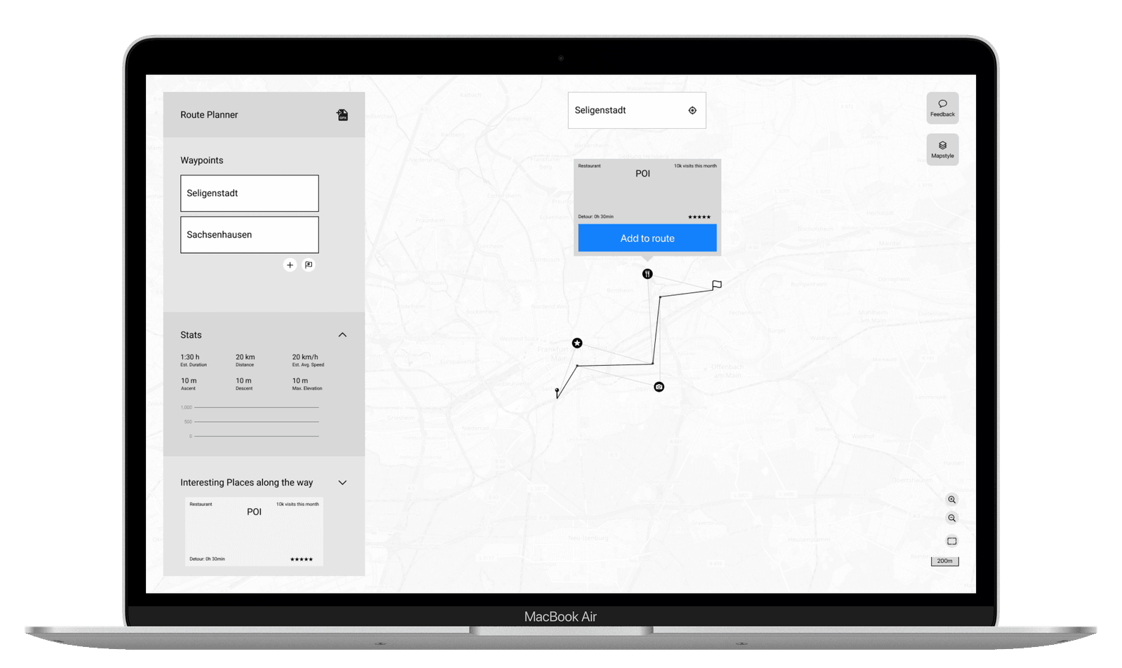
We tested every iteration, using Maze to see where people stalled, and ran a beta phase where users could keep the old AB Planner open beside the new web app. Two features were discoverable only on hover or click, reordering waypoints and switching a segment between “follow streets” and a straight line. They worried me in design and turned out fine, because people found them when the task called for them.
Sequencing around a busy backend
The initiative ran as seven epics, and the ordering was the product decision. Anything that could progress without backend capacity got pulled forward, and backend-dependent work was timed into the windows the team had. The spine was to rebuild the AB Planner on a new domain with no new features at all, purely to cut the external dependency, and only then add what the two tools had been missing.
Points of interest along the route tested well. People wanted supermarkets, water and scenic detours between A and B, and they lit up when they saw it. I cut it: a large build, not core to route creation, against a mandate of independence from third-party APIs. Cutting the best-testing feature in the project was right and it did not feel like it.
We also learned that users like route statistics and will not open a collapsed accordion to see them, which is a small finding with a large effect on the layout.
Outcome
The first version shipped and is live at web.bikemap.net/plan. My time at Bikemap ended with that release.
Overall usage held steady through the transition, which was the goal; the way this could have gone wrong was a measurable drop we then had to explain. Nearly all third-party dependencies were gone, with only the route detail pages and their map previews still on the provider. That was the next epic, and the legacy AB Planner was still running alongside the new tool.
Key learning: we found out how much the legacy tools mattered by switching them off by accident. Partway through the migration the legacy editor and AB Planner went dark in production, by mistake and not by plan. The response was immediate and loud, and it told us in a few hours what our analytics never had: a small group depended on those tools every day. Nothing in the research had shown it, because we had no meaningful behavioural tracking and were prioritising on qualitative input and stakeholder opinion. It changed how I ran the rest of the migration, and from then on we tested every capability moving to the new app before touching the old one. The uncomfortable version of this learning is that an accident was our best research instrument, which is a measurement failure.
Key learning: I pitched it on cost, so it got approved and nobody cared. The business case I led with was eliminating an expensive provider and the dependency that came with it. That is a real argument and it got the project funded. It also meant stakeholders acknowledged the initiative and showed no particular enthusiasm for it, and I spent the whole project pushing a rock that should have been rolling. I never told the user story at the top of a meeting: one coherent tool, our own map styles, routing profiles people would pay for. That was my failure to make the case, not their failure to hear it.
The regret I take out of this is the tracking. We instrumented the new app as part of the build, so the means to answer “which routing profile do people choose” and “where do they abandon” exist now. They did not exist while I was making the decisions, and I made two years of them on qualitative input and judgement. It worked. I would push harder and earlier for measurement rather than treating it as the nice-to-have that capacity never allows.
I was also lucky with this team, and that is not a throwaway line: Dominic and Sebi each covered a gap I could not have covered myself.